Sensible Living

My dad retired in 2007 and moved to Branson, MO. But my dad is a consumate creator and he quickly started up a small hardware business on Tindie. He built a series of smart home sensors and then also wrote PC software to manage them. When he showed me what he was working on, I thought it would be fun to chip in and add some UX help. I went out to visit him and we turned part of the trip into a 3 day UX crash course.
Process
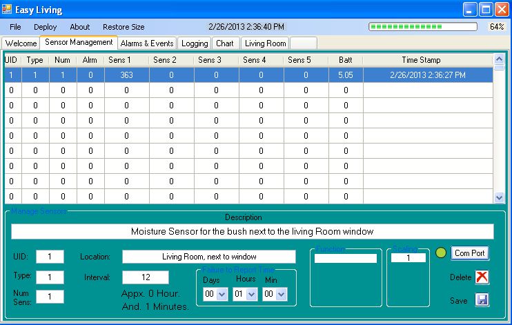
The initial sensor management layout looked like this:
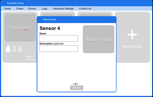
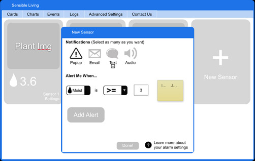
The initial onboarding experience looked like this:
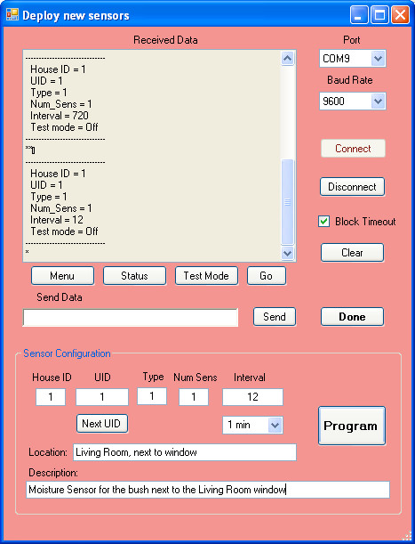
There are a few issues that I wanted to address:
- Spreadsheets are great for hardcore users, but not very accessible to a regular user. I wanted to find a design that would be easy for anyone to use and see the status of their sensors.
- Find a more user-friendly experience for onboarding new sensors. Have the application generate a UID automatically, humanize the labels and CTAs. Finally, remove any settings that can be predefined. All that a normal user should need to fill out is the name, description and add a picture if they want.
- Users would need to plug their device into the receiver in order to onboard each sensor. I wanted to see if there was any way the receiver could auto-detect the sensor.
- Quietly start to think about how this could be used on a mobile device.
After a few iterations, I came upon a card metaphor for each sensor. Card UI has been popular for a few years now and I see no signs of it stopping. As far as the onboarding process, I worked with my dad to cut all the fields that didn’t need tweaking for most users.
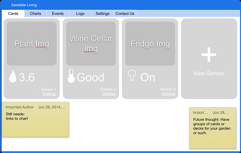
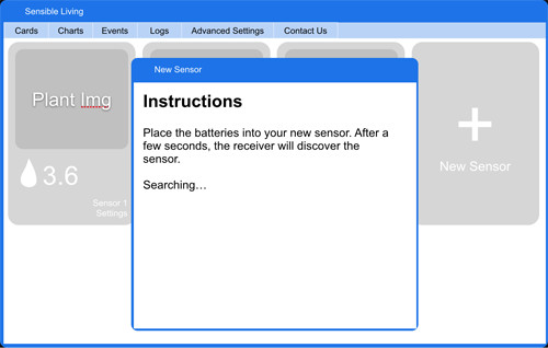
The first visual pass brought to light a few new ideas:
- The cards could color coordinate to their predefined type: moisture is green, temperature is blue, etc.
- In the event that a sensor held more than one sensor, could we test a design that had a stack of cards.
- Remove the border around the image.
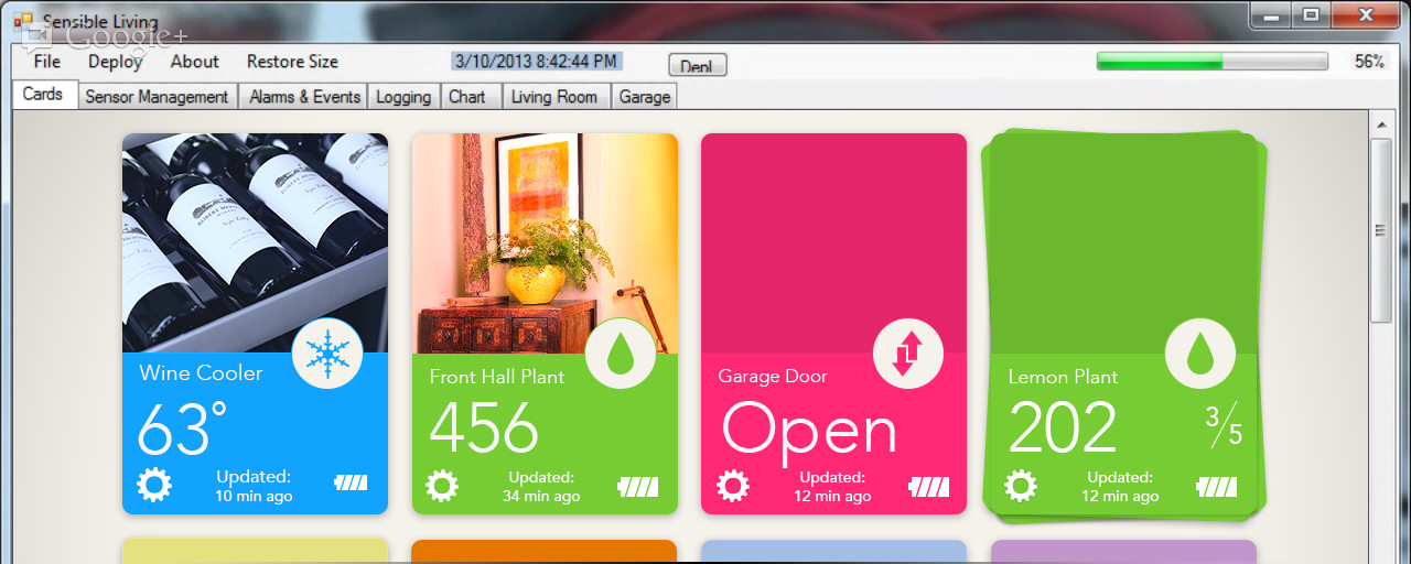
While there’s much to change and enhance, I felt like this was a good case study and not too bad for a three day workshop. :)
…if you noticed the interim image on the main page is a mobile design. That’s just a little preview of what is currently in the works.